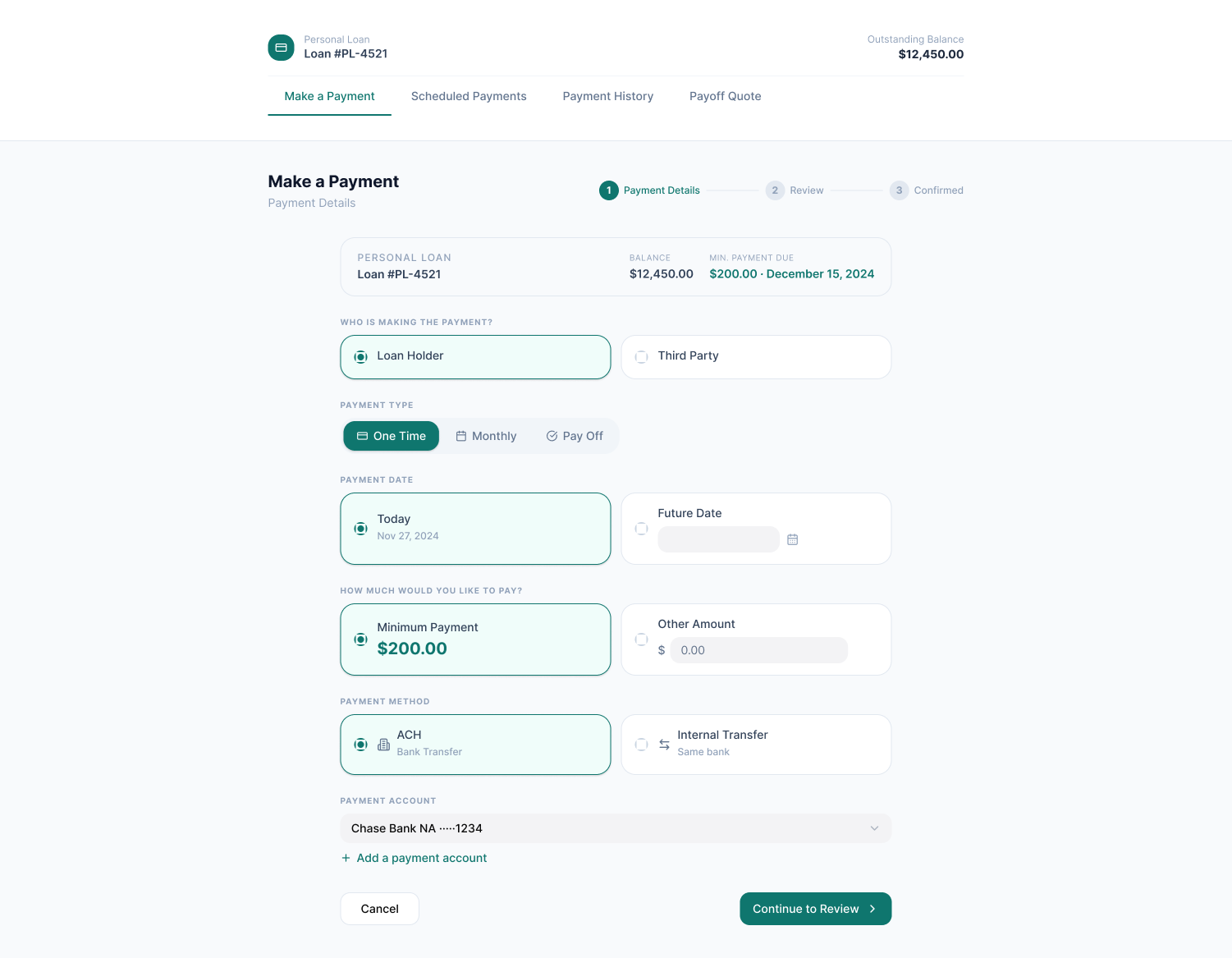
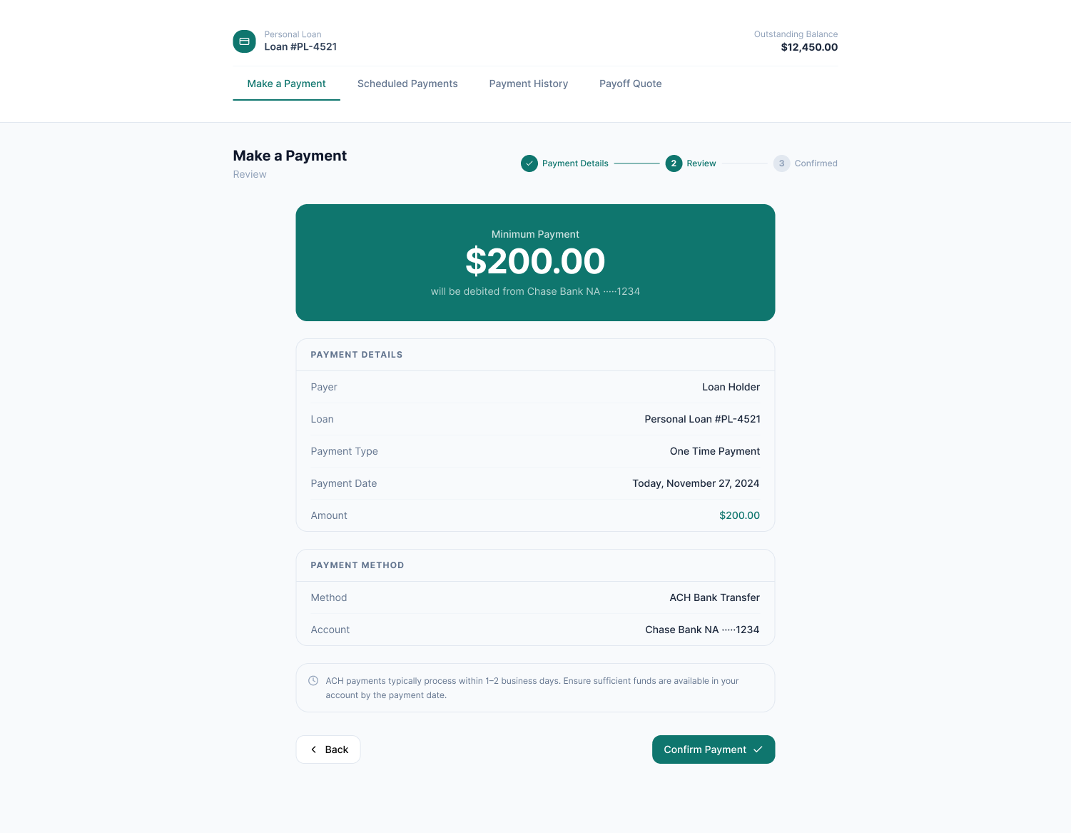
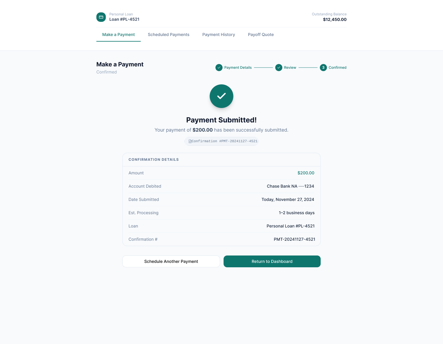
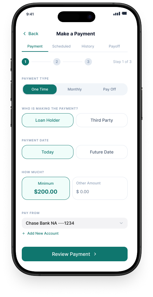
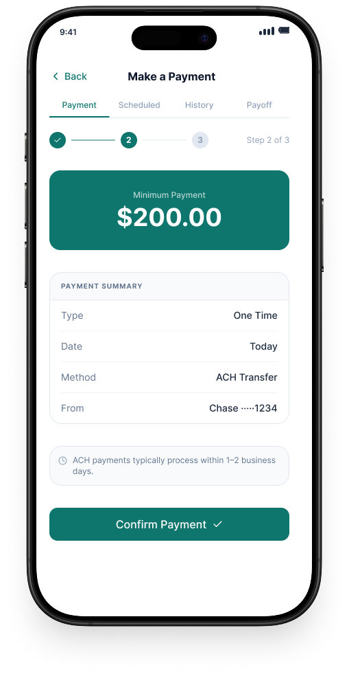
Redesigned a clunky, system-driven payments workflow into a conversational experience that matched how agents actually guided customers through live calls.
Overview
As part of a broader modernization effort migrating from a legacy Eclipse-based platform to React, I redesigned the payments experience used by customer service agents handling live payment calls. The existing tool was functional but fought against the natural rhythm of a phone conversation, forcing agents to navigate a system-driven interface while simultaneously guiding customers through complex payment decisions in real time.
The Problem
The original payments experience relied on a table-heavy layout, an awkward form structure, and unnecessary friction points like a redundant review step. Agents needed to handle one-time payments, scheduled payments, and payoff-related actions, but the interface made each of those feel more cumbersome than they needed to be.
The core issue wasn't visual. It was structural: the flow was organized around the system's data model, not around the sequence of questions an agent was actually asking the customer on the phone. Too much information was shown at once, decisions were presented out of order, and the experience created cognitive overhead at exactly the moment agents needed to be focused on the customer.
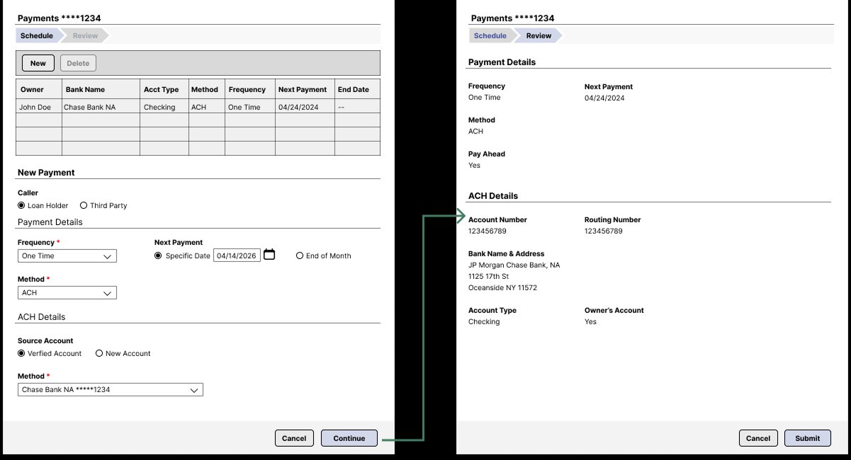
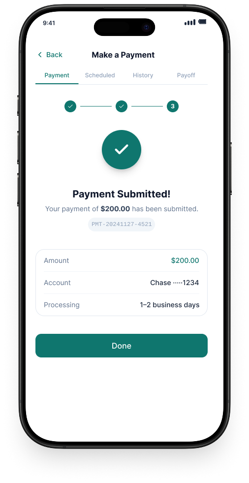
Legacy experience, structural recreation (details generalized for confidentiality)
The Goal
My Role
I led the UX design for the payments workflow redesign, owning the flow structure, interaction design, and visual execution. I was responsible for proposing the conversational flow model, the core structural decision that shaped the entire redesign, and worked closely with Product and Engineering to validate feasibility within the React component framework and existing compliance constraints.
Design Approach
The central design decision was reframing the flow from system-driven to conversation-driven. Rather than presenting all payment options and fields simultaneously, the redesign introduced progressive disclosure, surfacing information as the agent moved through the natural sequence of a payment call: who is making the payment, what type of payment is needed, when the payment should be made, how much the customer wants to pay, and what payment method to use.
This sequence mirrors how agents already guided customers verbally, so the interface became a reinforcement of their workflow rather than an obstacle to it.
At the navigation level, major payment sections, Make a Payment, Scheduled Payments, Payment History, and Payoff Quote, were separated into clear top-level tabs, giving agents direct access to each task type without hunting through a single monolithic screen.
Redesigned Experience
The redesigned Make a Payment screen organizes each decision into a distinct, labeled card using progressive disclosure. Agents move through the flow in the same order they'd naturally guide a customer on a call.
Redesigned Make a Payment screen, conversational question-based flow with progressive disclosure
As an extended design exploration beyond the original project scope, I applied the same conversational logic to a mobile-first layout, demonstrating how the progressive disclosure model translates naturally to smaller screens by breaking the flow into a step-by-step sequence with a single decision per screen.
Mobile adaptation concept, progressive disclosure applied to a step-by-step mobile flow
Outcome
The redesigned payments experience was delivered as part of the React migration and is currently used by customer service agents across banking and lending workflows. By restructuring the flow around the natural sequence of a payment conversation, the experience reduced on-screen complexity and gave agents a cleaner, more predictable tool for handling payment tasks during live customer calls.