Home / Work / Contact Management
Banking React Migration Internal Tools Visual Design

Customer Contact Management Redesign

Rebuilt a structurally inconsistent contact maintenance screen into a cohesive, scannable experience that finally felt like it belonged in the same product as everything around it.

Role

Lead UX Designer

Company

Discover Financial Services (Capital One)

Year

2023

Status

In Production

As part of a product-led initiative to migrate a legacy interface to React, I redesigned the customer contact maintenance screen used by service agents to manage address, phone, and email information. The screen had been partially updated in a previous effort but never fully resolved, it still felt disconnected from the product environment around it. The migration became an opportunity to fix that properly.

Confidentiality Note Some terminology and details have been generalized to protect confidential information. The design problem, approach, and outcomes reflect the real work.
Delivery Delivered to production as part of the React migration
Ownership Redesigned solo with collaboration from Product and Engineering
Scope Improved consistency across address, phone, and email management workflows

The contact maintenance screen was caught between two worlds. It had been touched in a previous update but never fully aligned, it didn't match the older Eclipse-based environment it sat next to, and it didn't match the newer React components being built around it. The result was a screen that felt like a foreign object inside the product.

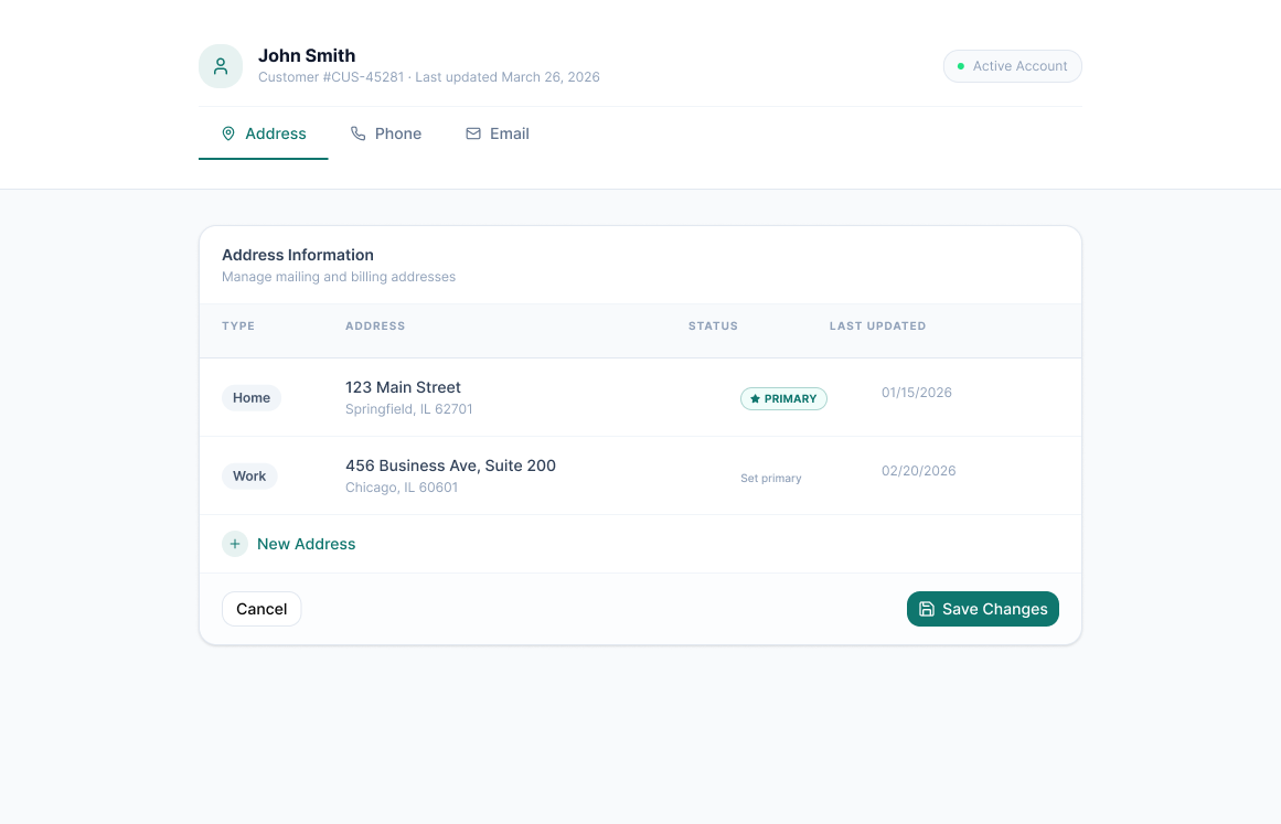
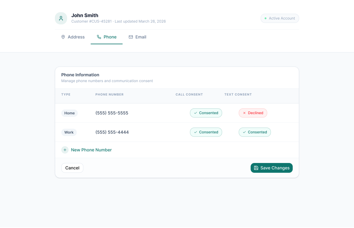
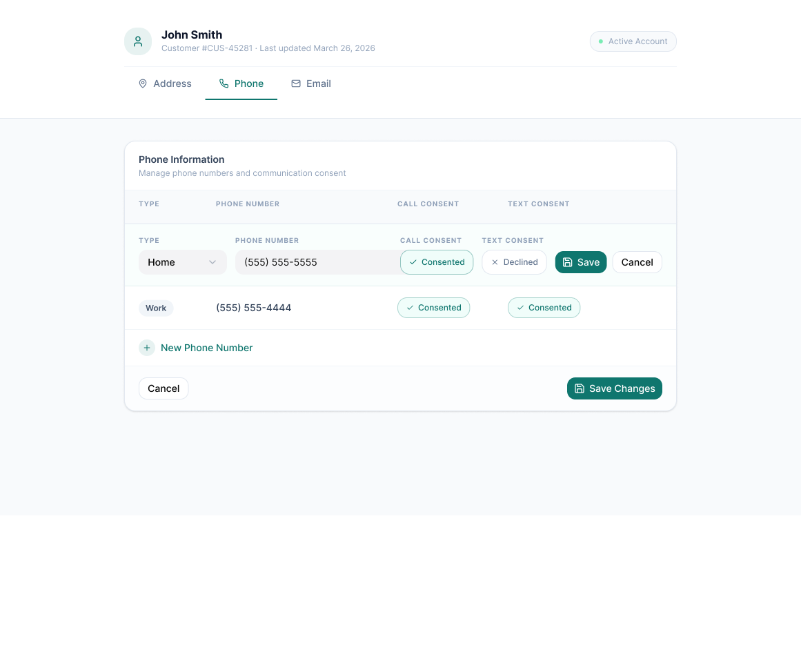
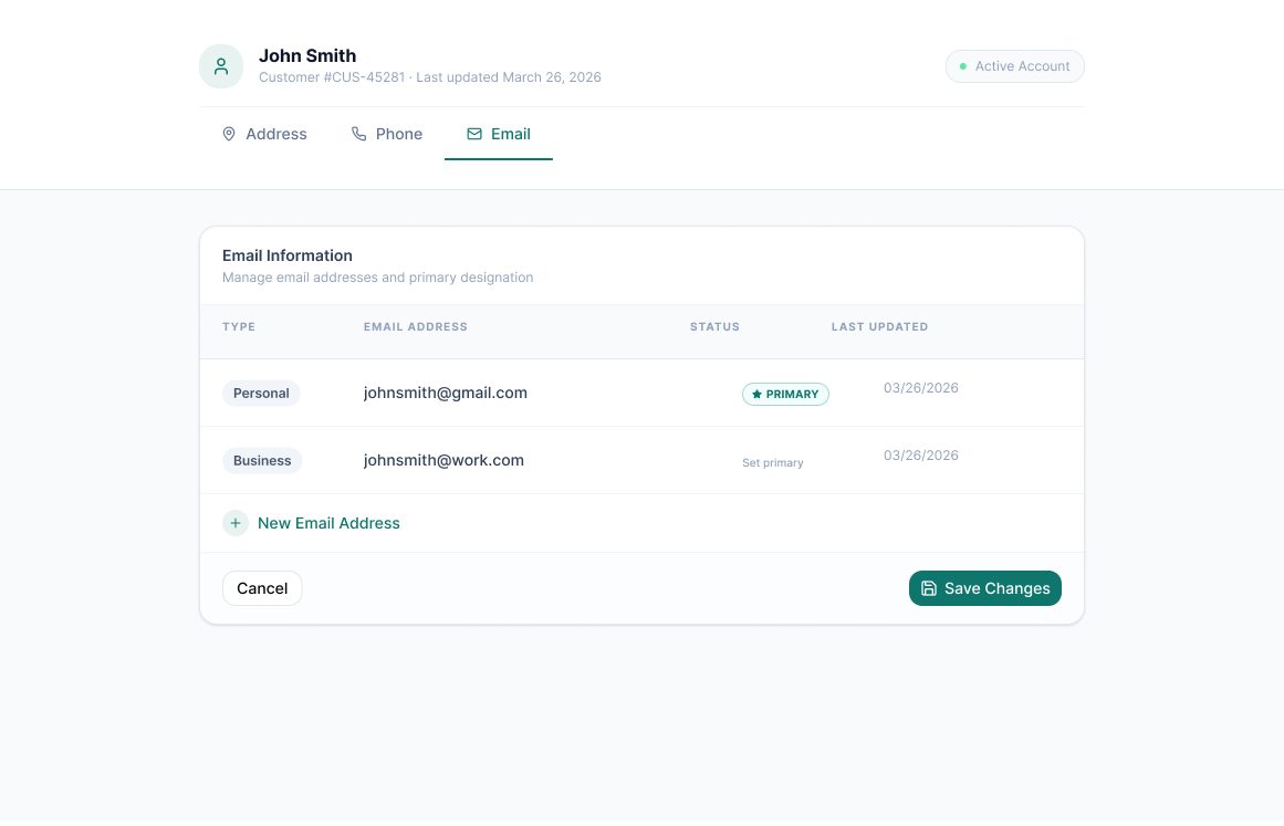
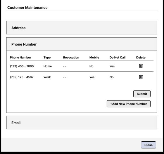
Beyond the inconsistency, the layout itself added unnecessary friction. Address, phone, and email information were all presented together in a single heavy form, no clear hierarchy, no visual separation, no sense of organization. Agents working quickly through customer calls had to parse a cluttered screen to find what they needed. It wasn't broken, but it was harder to use than it should have been.

Legacy contact maintenance screen, all contact types in a single cluttered form

Legacy experience, structural recreation (details generalized for confidentiality)

Everything lived on one screen; address, phone, and email stacked together with no clear separation between them

I owned the full design of this redesign, from initial structure through visual execution, working collaboratively with Product and Engineering throughout. The project was initiated by product leadership as part of the broader React migration, and I was responsible for translating that directive into a design solution. The core structural decision I made was moving away from the single combined maintenance form toward a tabbed, section-based layout, a call that shaped the entire interaction model for the redesigned screen.

The most significant structural change was introducing tabs to separate address, phone, and email into their own focused sections. Rather than presenting everything at once on a single heavy screen, agents now navigate directly to the contact type they need, reducing the cognitive overhead of parsing a combined form while keeping all the same functionality intact.

Within each tab, layout and hierarchy were simplified. Actions like viewing, adding, and editing contact details were repositioned to feel deliberate rather than buried. The visual design was brought into full alignment with the React-based component patterns being established across the modernized system, consistent spacing, type treatment, and component behavior throughout.

The shift from a single maintenance form to a section-based experience was a deliberate trade-off: slightly more navigation in exchange for significantly less clutter. For agents managing contact details quickly during live calls, that was the right call.

The tabbed layout gives agents direct, focused access to each contact type. Each section presents only the relevant fields and actions, phone numbers and consent settings in the Phone tab, email addresses and last-updated timestamps in the Email tab, without the visual noise of a combined form.

Redesigned contact management, tabbed layout separating address, phone, and email

Redesigned experience, tabbed section layout with focused phone and email views

The redesigned screen shipped as part of the React migration and is currently in production. The tabbed structure eliminated the visual clutter of the original combined form, bringing the contact maintenance experience into full alignment with the modernized product environment and giving agents a cleaner, more consistent tool for managing customer contact information.

Next Case Study

Conversational Agent Assist Panel